
Mobile Productivity App • Case Study
Kelly Mark, Bubbles Huang, and Melanie Sit
Mobile App, 30+ Screens
January – May 2024 (5 months) + November – December 2024 (additional 2 months)
Figma
Context
University students are facing a common struggle: finding the motivation to stay on top of their daily tasks. With heavy workloads, deadlines, and multiple responsibilities, many students often find themselves procrastinating and rushing to complete assignments at the last minute.
This leads to unnecessary stress, rushed work, and poor time management habits. Students are looking for a way to better organize their time and prioritize tasks without feeling overwhelmed. They need a simple, effective tool that can help them break down large tasks into smaller, more manageable steps, without getting distracted.
University students need a productivity app that can motivate them to complete tasks, keep stress levels low, and prevent distractions so that they can stay on top of their goals—both academic and personal.

BoboPomo is a productivity app for university students that breaks down big tasks and visualizes their progress.
My assigned tasks started with User Research and the Tasks page early on, then shifted to the Home page and onboarding flows.
As I began refining the project on my own time, I also continued to improve the other pages, redesigning the entire app and prototyping.
User Research
Wireframing
Prototyping
User Interviews


I conducted an online survey with 14 responses, followed by 2 user interviews via Zoom to gather deeper insights.
The results revealed that most participants struggled with procrastination, particularly on school-related tasks like essays and readings. Common reasons for procrastination included lack of motivation, boredom, and anxiety.
I then used an affinity map to organize and analyze the interview data, identifying key themes, pain points, and insights, which helped me better understand user concerns.
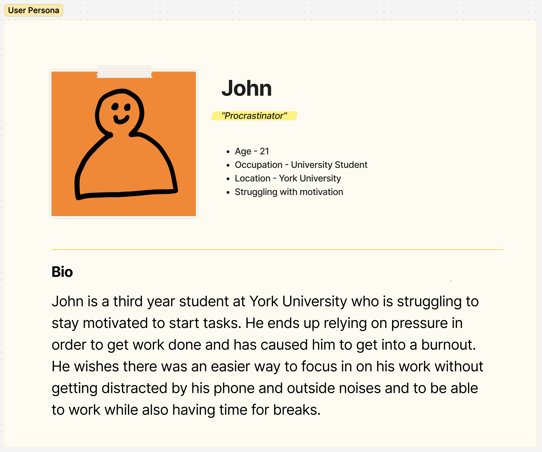
I then summarized all points made into user needs, goals, and pain points. This shaped our user persona to help us better understand our target audience.


We created a navigation flowchart to outline the user journey within the app, which helped us visualize the app’s structure and overall user experience. This flowchart served as the foundation for our design, guiding the placement of key features and flows. As we progressed with the project, we continued to refine and expand on the flow to ensure a smooth and intuitive experience for the user.
We started the design process by creating a shared Pinterest mood board to collect inspiration. Then, we sketched rough layouts and concepts for key app screens, followed by low-fidelity wireframes in Figma to establish structure, user flow, and navigation. Next, we created mid-fidelity wireframes, adding color and refining visual elements. After receiving feedback from our teacher and classmates, we combined the best ideas to develop a more cohesive design direction, moving closer to the app's final look.

Moodboard

Sketches

Low–Fidelity Wireframes

High–Fidelity Wireframes

Prototyping – Further Development
After a lot of back-and-forth with edits and tweaks, this is the last design we made together as a group. It wasn’t an easy process, especially since our university went on strike during the project. This meant we had to switch to online meetings, which changed how we collaborated as a team. But even though it was mainly done online, we were able to construct a design that aligned with our vision and goals.


As my own design skills improved over the summer break, I thought it would be fun to revisit this project and applied my new knowledge, refining the app even more. Here are some examples of the most prominent changes.
.png)


BoboPomo is a productivity app designed to help university students become more productive by breaking tasks down using the Pomodoro timer method, while also providing a creative outlet through art. The app’s playful name combines “Bobo,” a Filipino term for "idiot," to emphasize inclusivity, and “Pomo,” referencing the Pomodoro technique. With a fun, approachable design inspired by art and stationery, this was a group project that I later refined, applying new design skills.
Taking inspiration from the theme of using art as an outlet for stress, the system features colourful yet soft colours. For the app's typography, two typefaces were carefully chosen: Mochiy Pop One, to represent the brand’s playful, creative style, and Poppins, to prioritize legibility, while keeping in the playful theme to create a friendly and practical experience.


Different Characters,
Different Methods of Motivation.
Meet the Bobos, cute characters that help the user, tailored to their work style.
Unique Reminders,
Different for Each Bobo.
Need negative reinforcement? Blaze has got your back! ...or more like watch your back...

Feel the greatness of your successes!
Wow, Devin smiled for the first time?! If you want even more praise, definitely choose Rose as your buddy. 💕
Group Study Session!!
Invite your friends to study with you, and enter a group focus session together.

Art as an Outlet for Stress
Congrats! You’re done your pomodoro session. Now its time to draw and relax.

Different Draw Modes
Don’t know what to draw? Prompted mode will help you out.
No brakes, Just gas 💨
Wanna quit the session? Nah, your Bobo buddy will stop you. Try it if you dare.

This is a Pen.
.png)